Uniform Review: University of Miami Hurricanes Football
Miami occupies a unique place in the U.S. psyche. Whether you pronounce it "MY-ami", "me-AH-me", or "my-AMUH", it is an idea as much as it is a city. Like Los Angeles, it is unrepentantly preoccupied with image; like Las Vegas, it exists as an exercise in excess. It is a melting pot, figuratively and literally; a tanned, toned, and sweating city that will party until it's underwater. Miami, most of all, is defined by its contradictions: Pain & Gain and Art Basel, Kendall and the Everglades, Pitbull and the New World Symphony.
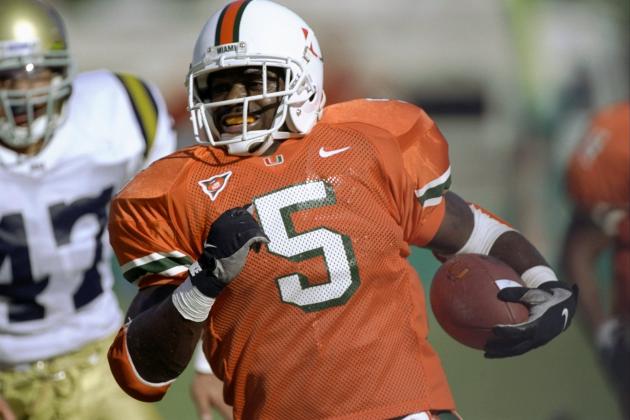
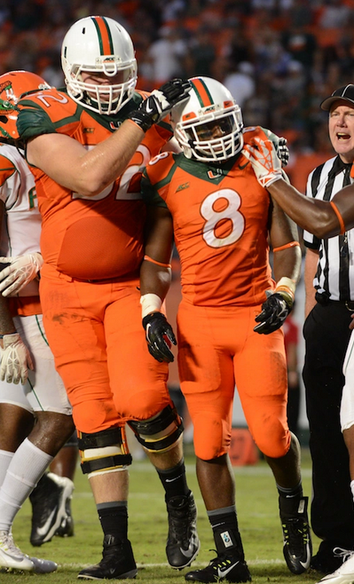
Billy Corben's documentary The U perfectly sets the University of Miami football team's heyday of four national titles over nine seasons in this swamp of civic identity. With strength, speed, and style, these largely African-American squads, clad in orange cut-off mesh jerseys and white helmets with the distinctive split-U logo, flaunted on- and off-field rules and became the face of a largely white student body and an increasingly Latino city. The football program, cast as the villains of the college football establishment (games against Notre Dame were billed as "Catholics vs. Convicts"), shed light on the fraught racial politics of pro and big-time college sports and the hypocrisy of the N.C.A.A. They were outsiders, the bad guys; the Hurricanes were thugs before Richard Sherman, 2 Live Crew at a sock hop. Much like its namesake city, the University of Miami Hurricanes football program became a manifestation of the extreme, provoking in sports fans a unique mix of the criminal with the sublime, excessive (and sometimes obscene) celebration with unprecedented success. The U invented swagger.


Click on images throughout this post to enlarge.
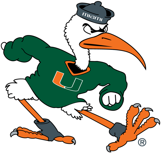
After a fifth championship, in 2001, the University has backed the football program away from its successful yet unmarketable identity. They left the Big East Conference for the Atlantic Coast Conference, moved from the intimidating and historic Orange Bowl in Little Havana to the sterile home of the NFL's Dolphins (a mere 45 miles from campus), and hired an outsider, Al Golden from Temple University, as coach. Sebastian the Ibis, who in mascot form at one point roamed the Orange Bowl in fatigues and a toy firearm, first lost his pipe then was reimagined as a sleek, abstract bird whose wing, if you squint enough, doubles as a cartoonish hurricane. The uniforms similarly evolved from plain sets with collegiate block numbers to jerseys and pants with sweeping colors and curved type.


This season, the Hurricanes introduced the most significant uniform change since adopting white helmets in 1977. Four sets of jerseys and pants, in orange, white, green, and gray (now known by the marketing-friendly titles "juice", "stormtrooper", "surge", and "smoke"), join three helmets to form a buffet of options for game days.
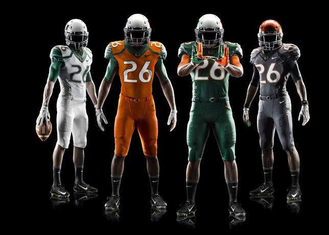
Credit: Nike
The rounded numbering remains from previous years, an unfortunate decision. The varying thickness within the characters, along with their upright disposition, make them appear static and bulky. Compare Miami's numbering to the italicized Futura Condensed used by the Steelers; the latter are far more dynamic, and something similar would have better complimented the speedy Canes.
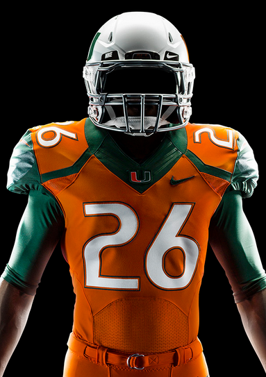
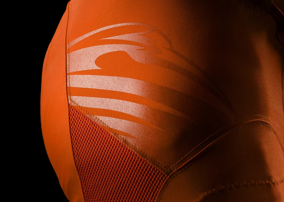
The various iterations of jersey and pant striping have been scrapped, replaced by a sublimated image of the stylized ibis logo. While these make seductive close-up photos, they look incomplete and, frankly, confusing on the field. Unless viewed at just the right angle, the ibis is invisible on the pants; it is similarly obscured on the shoulders, except here Nike has kept the beak orange against the green or gray background. The effect is that the Hurricanes appear to be sporting lighting bolts.

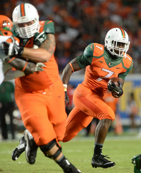


Additionally, the use of different materials of the same color end up destroying the monochromatic look. There appear to be at least four different materials used in the jersey alone: the main stretchy fabric, a mesh below the numbers, the Flywire neckline, and another mesh near the armpits. Not only do these materials look dissimilar on a mannequin, but they all absorb sweat differently. This is a common problem with modern uniform technology that is only exacerbated by matching helmet-jersey-pants sets, which have gained in popularity recently.
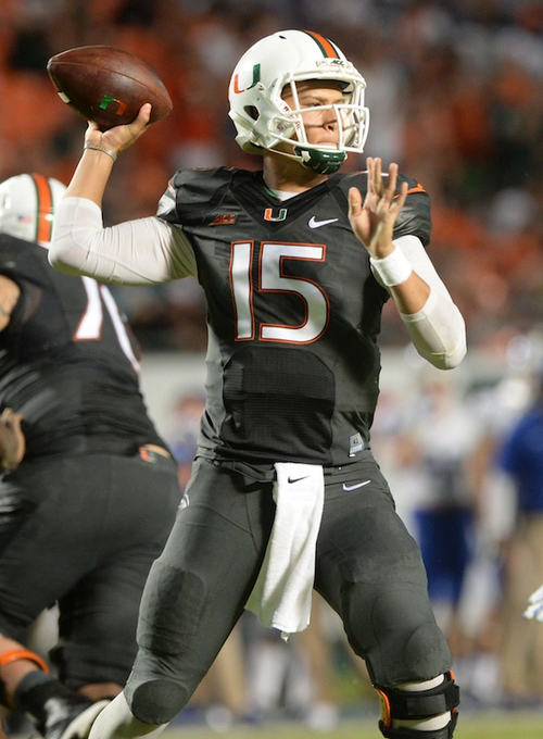


The traditional white helmet with white facemask is retained, now joined by orange, green, and gray lids with chrome facemasks. On these new helmets, the center stripe is deleted, the U is reflective and larger, and the stylized Ibis is sublimated as a background. Once again, the highly abstract background logo and color-on-color leave the helmets looking confused, the ibis and the split-U in an uneasy tension.


It is strange that the stylized ibis logo plays such a large role in this uniform update; the split-U was adopted as the university-wide identity in 2011 while this ibis has been largely ignored by the athletic department since its introduction in 2000. The ibis and number typography feel like visual leftovers from the previous generation of uniforms while the introduction of reflective materials and sublimated images are decidedly of-the-moment additions. Unfortunately, this assembly is neither groundbreaking nor particularly good; it is, perhaps, what the current program deserves.